
Creating a team mark for some of NZ's best riders
CW is a new brand mark developed for Cycleways. It’s for those riders who want to wear less obvious branded cycling apparel. We wanted the CW logo to become a more intriguing part of the company - applied to some slick apparel, products and comms. It’s also proudly worn by some of New Zealand's best riders with the guys rolling out various CW Race Crew team gear and merch.
LOGOS

Wayfinding for a world-class mixed-use development
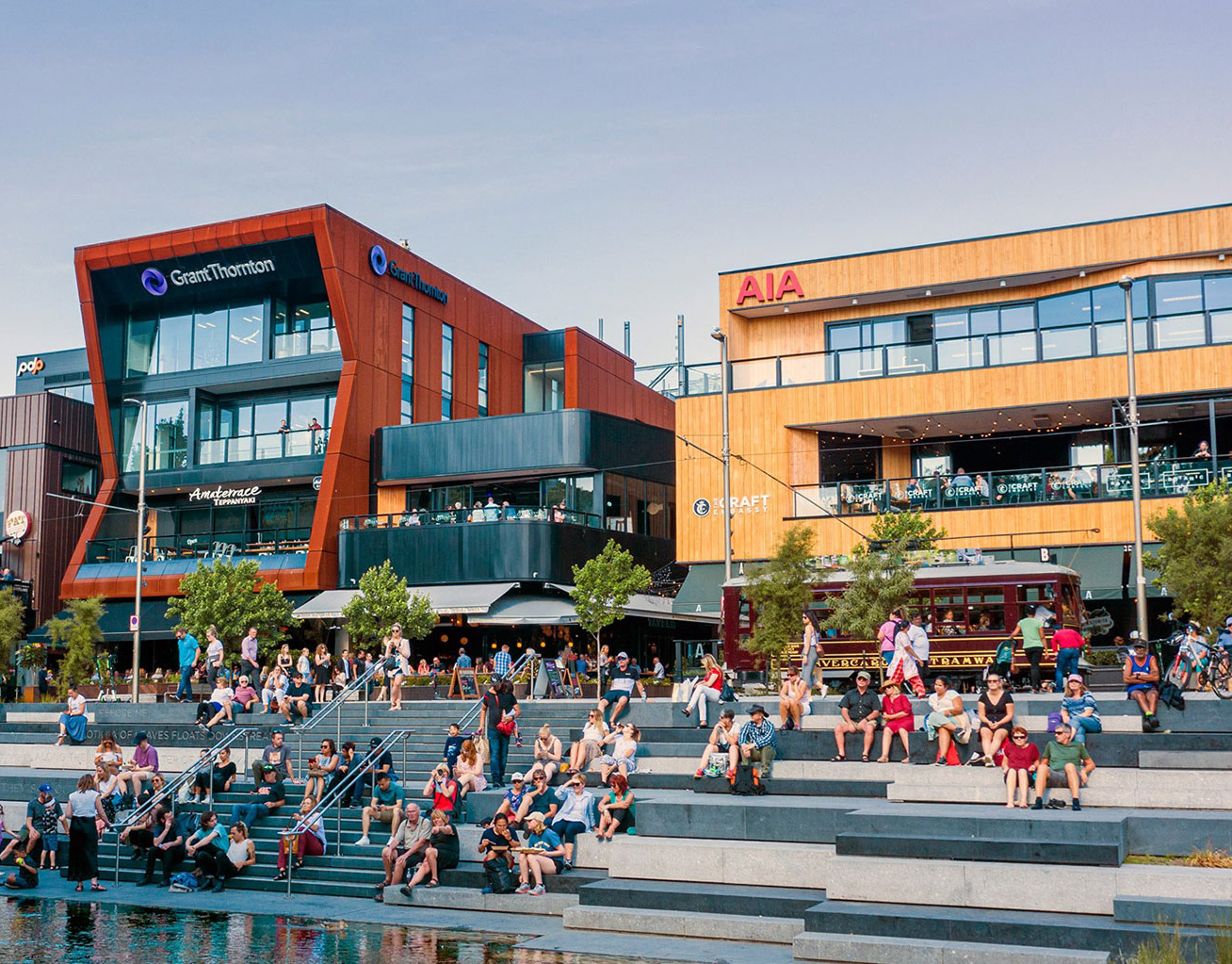
I was introduced to The Terrace in 2020 and was asked to come up with some theming concepts for an entrance foyer and lift lobby space. That was well received by the client, and soon led to several other creative briefings including an wayfinding project to greatly support the brand and improve navigation around the precinct. I delivered expertise in wayfinding planning, branding, interior graphic design, retail understanding, signage project management & production liaison.
The Terrace is a world-class mixed-used 8,500-sqm commercial development in Christchurch with 17 hospitality businesses, retail and office spaces. The development site was completed in 2018 and occupies half a city block on the banks of the iconic Avon River. It was developed to become a vital hub in the heart of the city and provide a vibrant, urban neighbourhood for both its local community and international tourists. The four buildings in the complex are intersected and activated by a series of character laneways. Some of the new signage has been installed, and other signs in the development plan are soon to be implemented, we are just awaiting some remaining tennants to move into this great new space. Exciting stuff.

Brand regeneration for a Sustainability Company
Paragon Impact is an award winning ESG & Sustainability Reporting Tech Company - with a mission is to contribute to the sustainability of our planet and its people by providing technology that enables transparency, accountability, and empowers growth alongside positive impacts aligned to the United Nations Sustainable Development Goals.
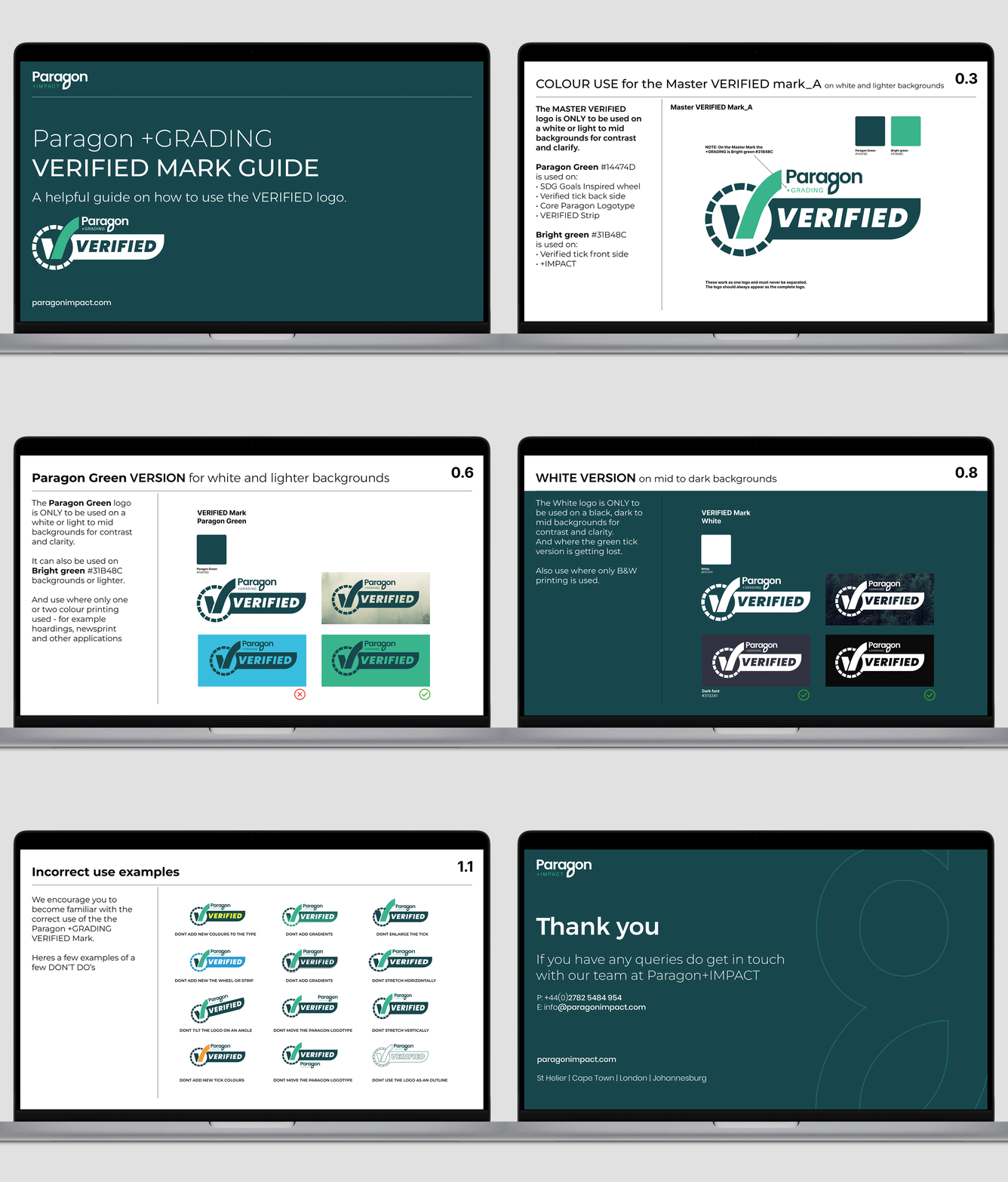
Daniel was first briefed to create a series of logos & guideline documents for Paragon Certified & Verified. Also building a SDG graded badge that would align with UN SDGs. Other ongoing projects include website refinement and improved user experience design for Paragon. Bespoke on-brand icon creation for UX application, digital stationery & digital presentation design templates.
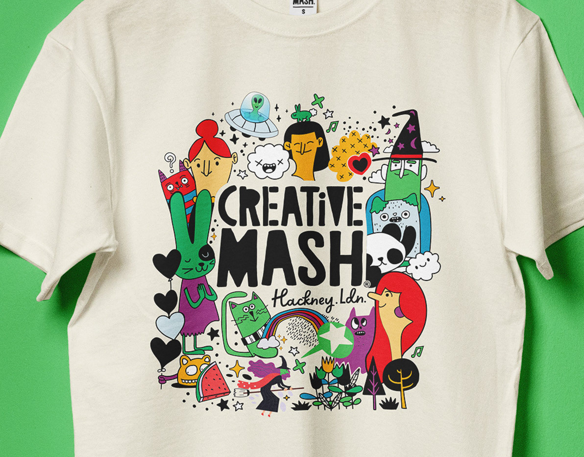
Brand design & illustration for creative kids education
Established in 2007 in London, UK, Creative Mash has become one of Hackney's favorite creative workshops for kids. This independent school offers drama and theatre classes, alongside engaging holiday activities, designed to inspire and nurture young people. Through performing arts, our programs enhance cognitive, emotional, and social skills, promoting self-expression, confidence, creativity, and an appreciation for diversity and individuality.
We’ve crafted this quirky and vibrant brand from the ground up, starting with the initial logo design and developing unique character illustrations. Our work also includes creating regular seasonal promotional campaigns, both online and offline, as well as designing signage, flyers, and a line of popular tees and merchandise. The kids and the parents both love it.
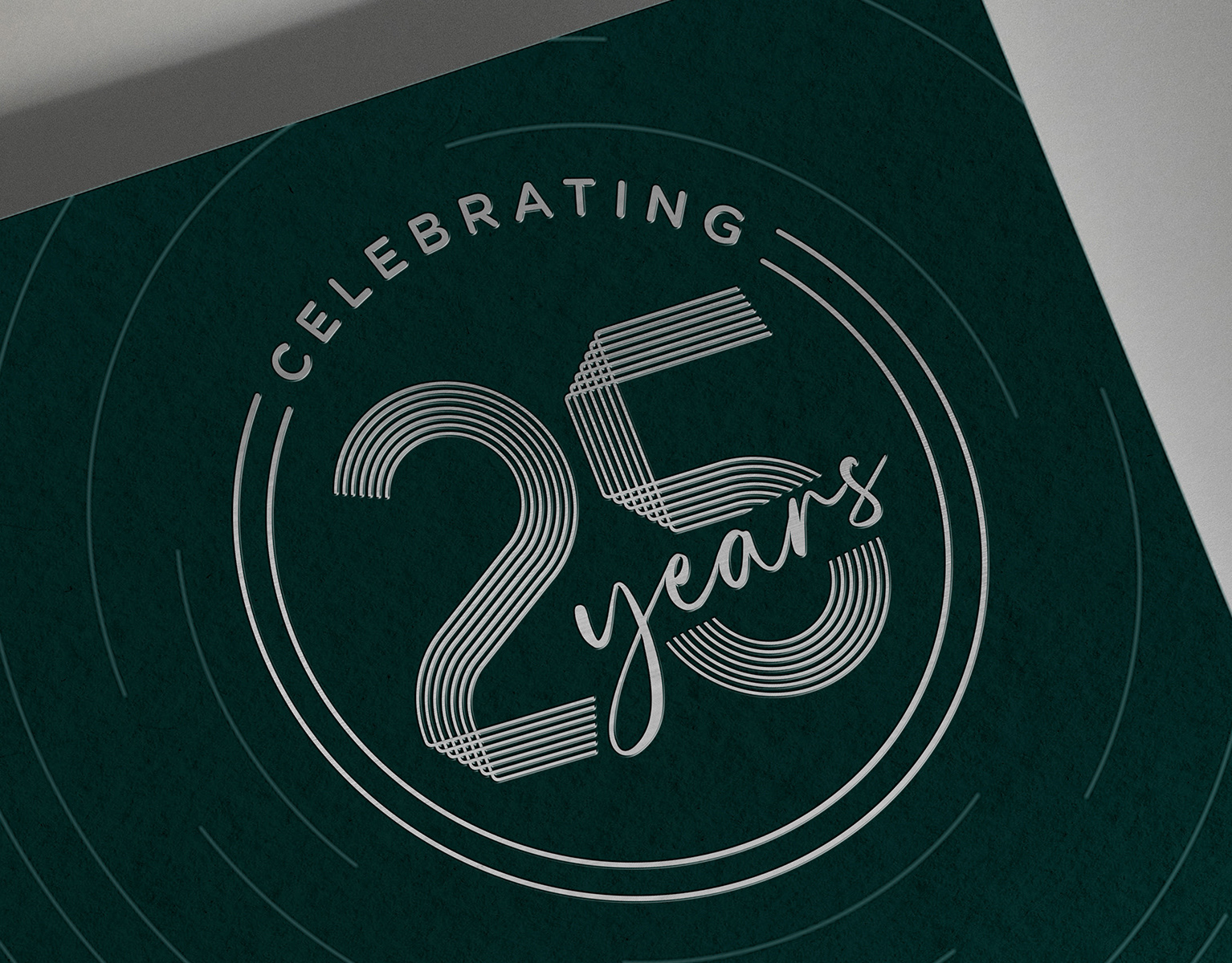
25yr celebration logo and campaign creative
The Eldernet Group Celebrates 25 Years Of Empowering People in 2022. Daniel was asked to develop a campaign logo and advert with a series of various sized digital billboards across NZ airports. This also included nationwide ad coverage in press & other print media. I also designed a premium invitation that was individualy addressed to many NZ vips to attend a special event, which included an appearance by 2022 New Zealander of the Year, Tā Tipene O’Regan ONZ. The milestone coincided with the opening of the organisation’s new building. The 25yr mark inspired by the NZ tapestry icon that I also created - integrated into several different lockups with the “Empowering people since 1997” wording and the group identity. These lockups where also used accross digital landing pages, social profiles and product to share the celebration milestone for New Zealand’s most trusted provider of information for older people.
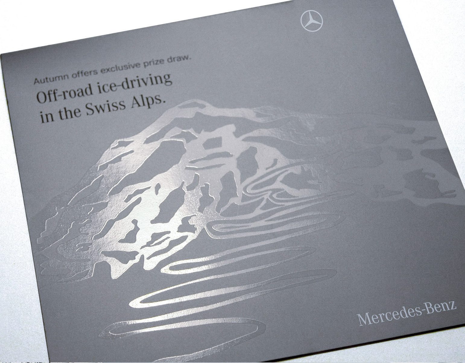
Mercedes-bespoke-Swiss-Alps-brochure
I was headhunted by London’s dynamic independent agency, Weapon7, to bring my expertise in design and typography to their key Mercedes account. It was a pleasure producing so many amazing projects with such a talented bunch of peps. Being trusted to deliver innovative creative solutions for one of the world’s most iconic automotive brands. My work spanned high-impact new model launch campaigns, including dm, pos, press and magazine ads, digital email marketing, and bespoke promotional communications. No surprise like most smart independents Weapon 7 later merged into the AMV BBDO network. Heres a glimpse at just a few projects I designed.
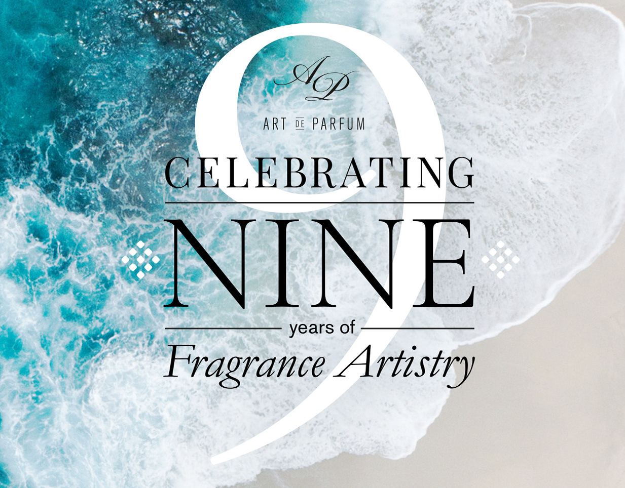
Helping a parfumerie celebrate French sophistication
Art de Parfum is an award winning, niche fragrance company that places ethics at the heart of its operations. One of the first ethically sourced and manufactured perfume brands, all Art de Parfum fragrances are 100% made in Grasse, France, are environmentally-friendly and free of materials that add to third world exploitation. I was asked to help create campaign concepts to celebrate the 9 years of Art de Parfum. This included designing a multiple use logotype mark to support key touchpoint communications. After that campaign work success, I was also briefed to design other seasonal brand creative for social media.
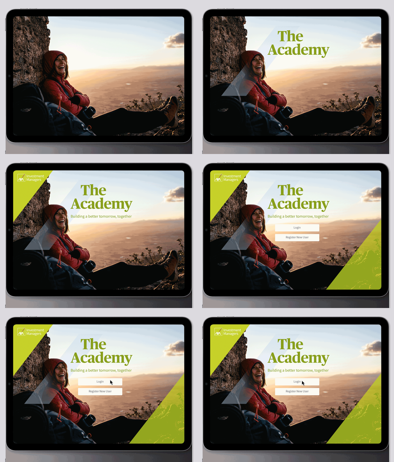
UX design for AXA
Here's a glance at one of the many user-focused projects I created when working with the global digital platforms specialists & creators TBC TV. We were asked to develop and launch the first two of many training modules designed to help AXA strengthen relationships with intermediaries and online-based platforms. It was named Beyond Bond Basics - The Academy. The content needed to be simple, easy to consume, and enjoyable to work through. In other words, great UX. I was briefed to deliver an overall style for pages on the training platform, user profile pages, multi-choice question pages, and pages showing video. And of course design the graduation certificate. The creative had to be fully responsive, as many of the advisors work on pads. This was a good example of creative once approve my client - I would produce a concise creative UX handover to the development teams.
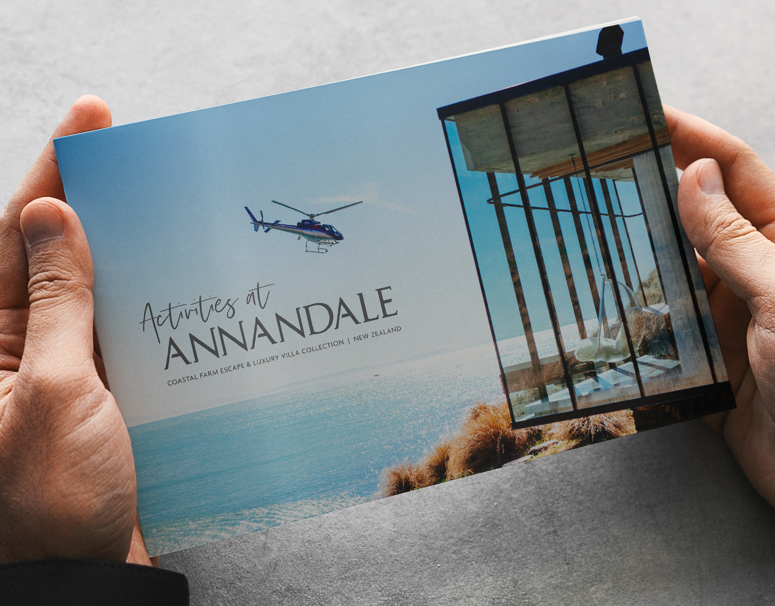
Annandale Luxury Villa Collection Promotions
Annandale® is a luxury coastal farm escape offering four award-winning villas for exclusive use providing some of New Zealand’s most luxurious accommodation set in breathtaking and dramatic landscape. I created bespoke activity booklets. Designed, managed & delivered seasonal campaigns accross via sends, social and online. I sourced, briefed & oversaw SEO & developers on various content & design updates to the current website. I also provided photography on the property & its unique surroundings.
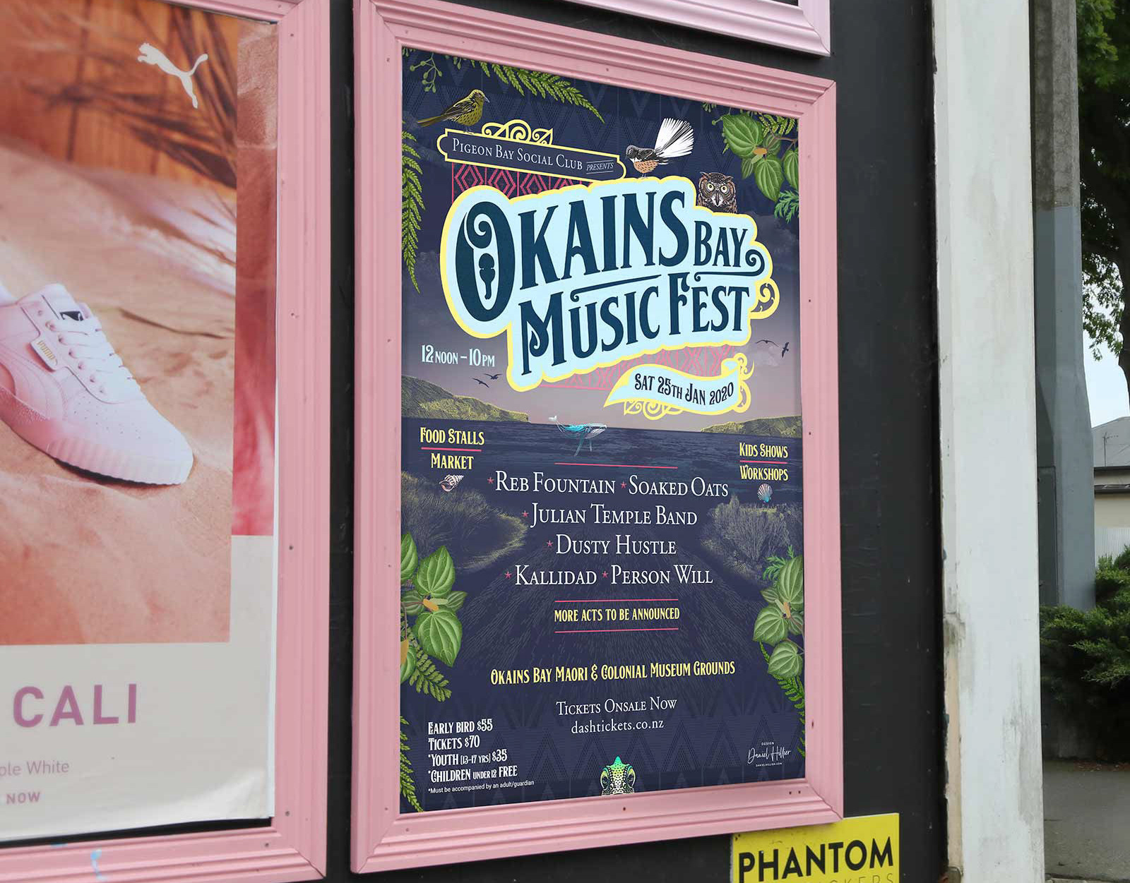
Okains Bay Music Festival - Identity & Promotion
Okains Bay Music Festival - Identity & Promotion
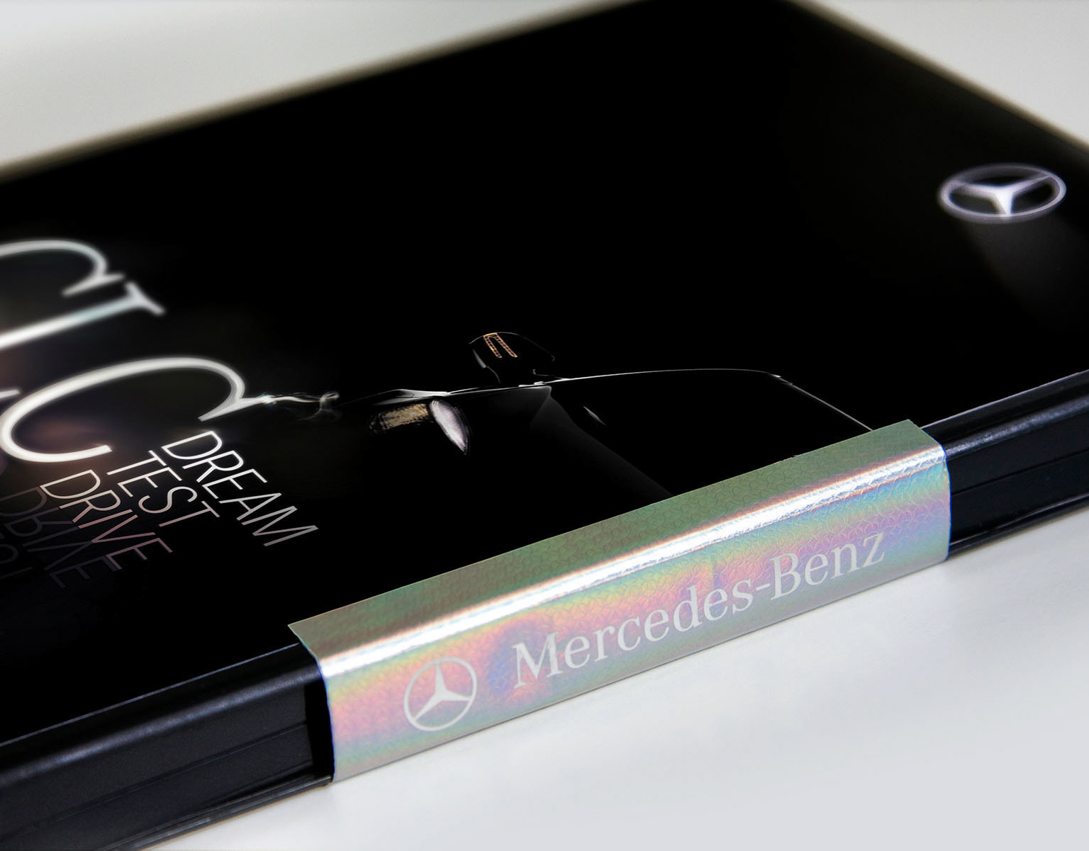
Specialist design and typography for Mercedes
I was headhunted by London’s dynamic independent agency, Weapon7, to bring my expertise in design and typography to their key Mercedes account. It was a pleasure producing so many amazing projects with such a talented bunch of peps. Being trusted to deliver innovative creative solutions for one of the world’s most iconic automotive brands. My work spanned high-impact new model launch campaigns, including dm, pos, press and magazine ads, digital email marketing, and bespoke promotional communications. No surprise like most smart independents Weapon 7 later merged into the AMV BBDO network. Heres a glimpse at just a few projects I designed.
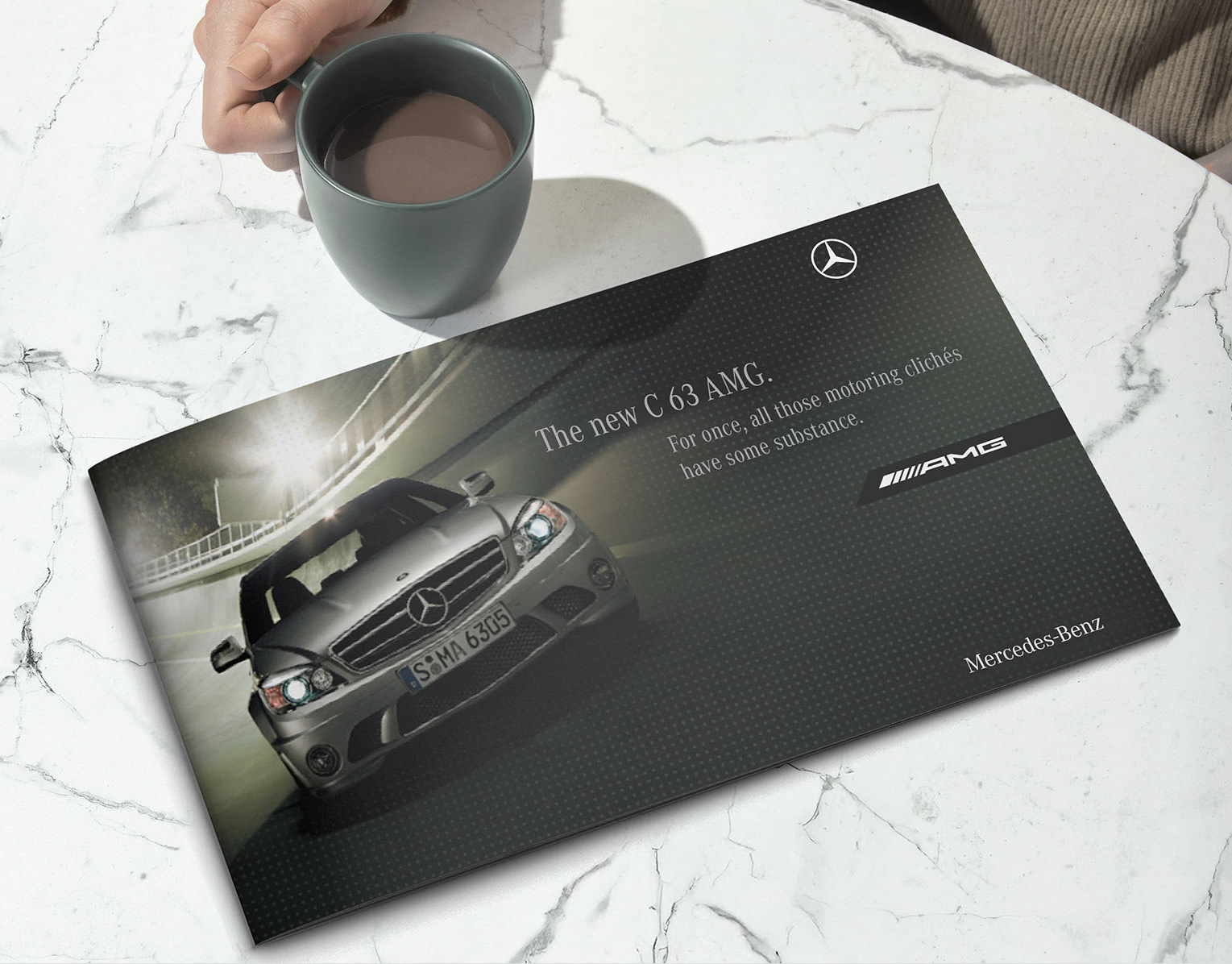
Unleashing Elegance for the new AMG Mercedes
I was headhunted by London’s dynamic independent agency, Weapon7, to bring my expertise in design and typography to their key Mercedes account. It was a pleasure producing so many amazing projects with such a talented bunch of peps. Being trusted to deliver innovative creative solutions for one of the world’s most iconic automotive brands. My work spanned high-impact new model launch campaigns, including dm, pos, press and magazine ads, digital email marketing, and bespoke promotional communications. No surprise like most smart independents Weapon 7 later merged into the AMV BBDO network. Heres a glimpse at just a few projects I designed.
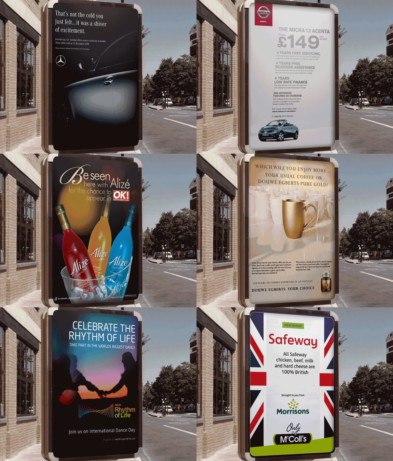
Designing ATL & TTL adverts for agencies and brands
Heres an glimpse of a few of the brands I've designed or art directed lead creative for ATL, TTL advertising and marketing promotions campaigns. This has been for various agencies and brands - showing my experience and ability to adapt across a diverse range of clients and find key solutions for rollout across various media formats.
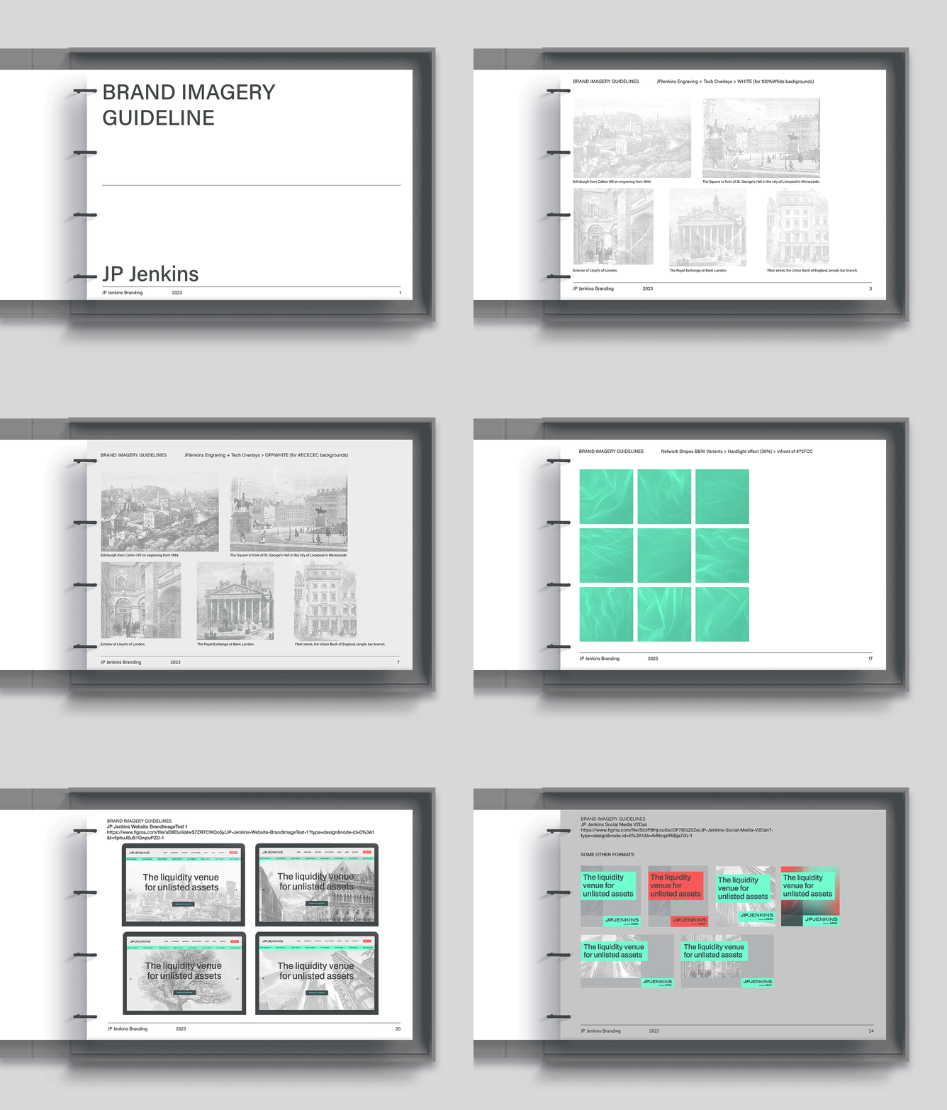
Transforming one of the UK's leading fintech brands
JP Jenkins is the UK’s oldest platform for private companies. I was asked to revitalise the well established companys branding and imagery for a more engaging multi channel brand experience.
The seed was planted with imagery of the acorn and through growth, becomes the majestic British oak tree. A variety of oaks can be isolated or depicted in legacy landscape scenes. Mixing historical & modern imagery with network stripes graphics overlaid to connect & create onbrand imagery. Other imagery includes Britain’s commercial centers via a series of old & new architechural engravings & contemporary photography.

Small Luxury Hotels – BE OUR GUEST campaign

DESIGN ARCHIVE: Evolution of an iconic Kiwi surf brand
Take a nostalgic ride back and see a surf brand I developed through the years with one of the biggest surf hardware stores in New Zealand.
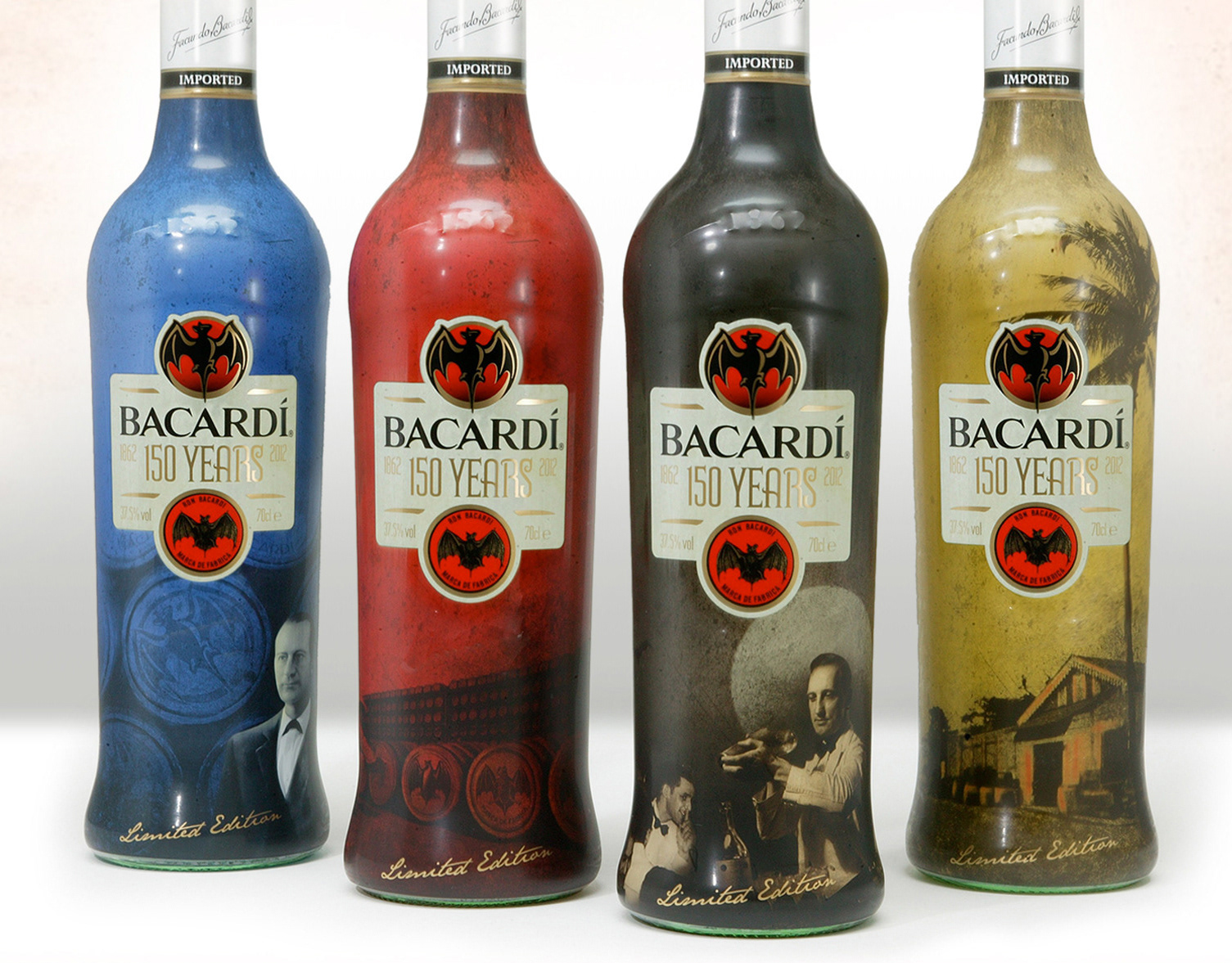
Bacardi 150 year Limited Edition bottle design
I enjoyed drinking all four bottles—just not all at once. Y&R Mars London requested my art direction and design, on a nifty project—to design a bespoke set of bottles to celebrate 150 years of Bacardi. And in support of the bottle collection, create key communications for a tasteful and effective shopper campaign to promote the unique bottle set in UK supermarkets. Each bottle tells a special story in of the rums history, from the vision of its founder, Don Facundo, to the legend of the iconic bat symbol. And we couldn't miss out on the birth of cocktail culture in Cuba. The legacy idea across four colorways worked a treat. The client loved it.
Agency: Y&R Mars
Brand: Bacardi
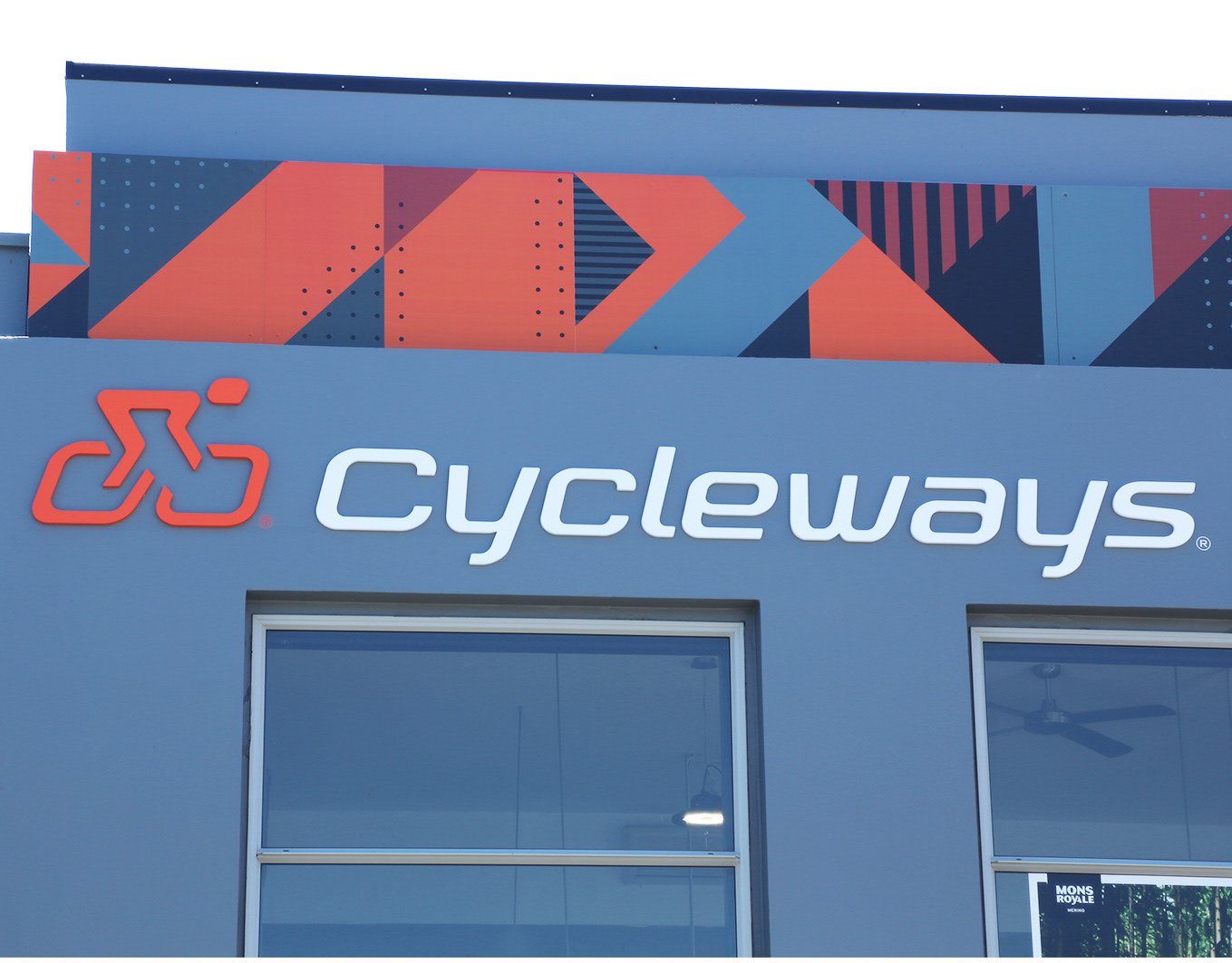
Cycleways Logotype & Identity Rebrand
Since bmx racing in my early teens in NZ, to commuting daily in London for over 16yrs – two wheels has always been second nature to me. After creating the original Cycleways logo a few years back, then returning to New Zealand. It was a pleasure to be asked to help out again to refresh the brand for one of NZ’s sweetest cycle stores. I refined and created a totaly bespoke logotype for a more current look. We then applied the new mark accross the brands many touchpoints including exterior & interior build signage, eco stationery. Including a neat Specialized® colab custom water bottle design.
I was also required to design a new and improved website & shop to showcase Cycleways great range of ride gear. The key component of the brief was to attract the nationwide cycle community to engage & utilise the bike site & allow clear navigation to the shop, or the workshop section of the site. Plus intergrating the instagram feed, stories & a lifecycle newsletter section.
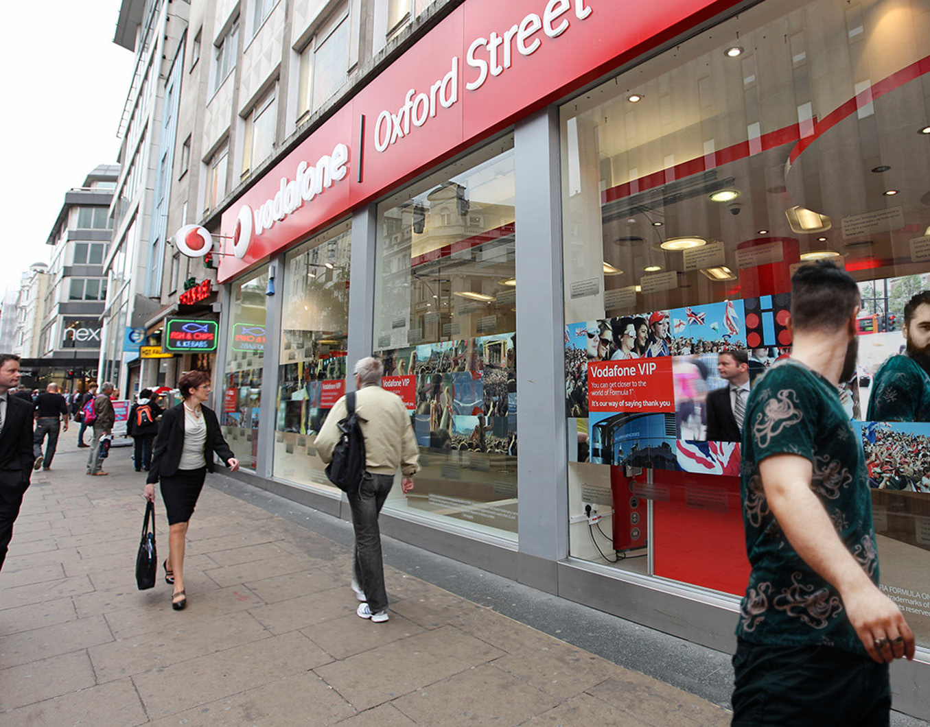
Turning heads with a reflective window campaign
Vodafone loved my idea to intergrate mirrors onto the window creative. As it caught the attention of passers by and empowered the “you can be at…” communication.
One of many promotional projects I co-led key design creative for outdoor & instore POS. This included strategic creative for key messaging, creative theming across more than 350 UK stores. Creative oversee of campaign branding across digital platforms.
Vodafone UK operated a 'VIP'reward scheme in which customers could access tickets 48 hours before release for major UK events including London Fashion Week, British Grand Prix & several music festivals including Reading & Leeds festivals. It was great to be an integral part of the team that produced such a successful campaign.
Agency: TMS
Brand: Vodafone UK
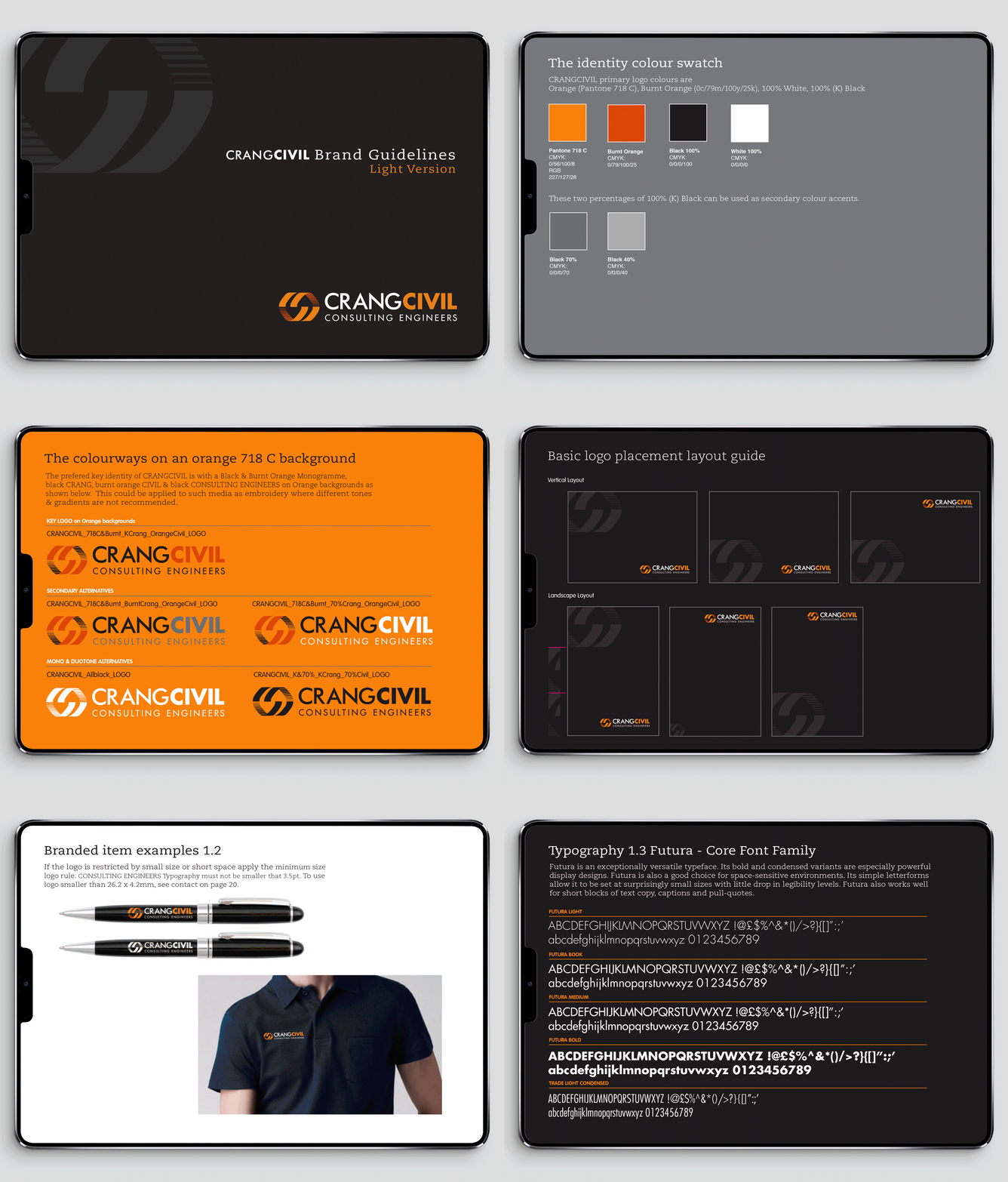
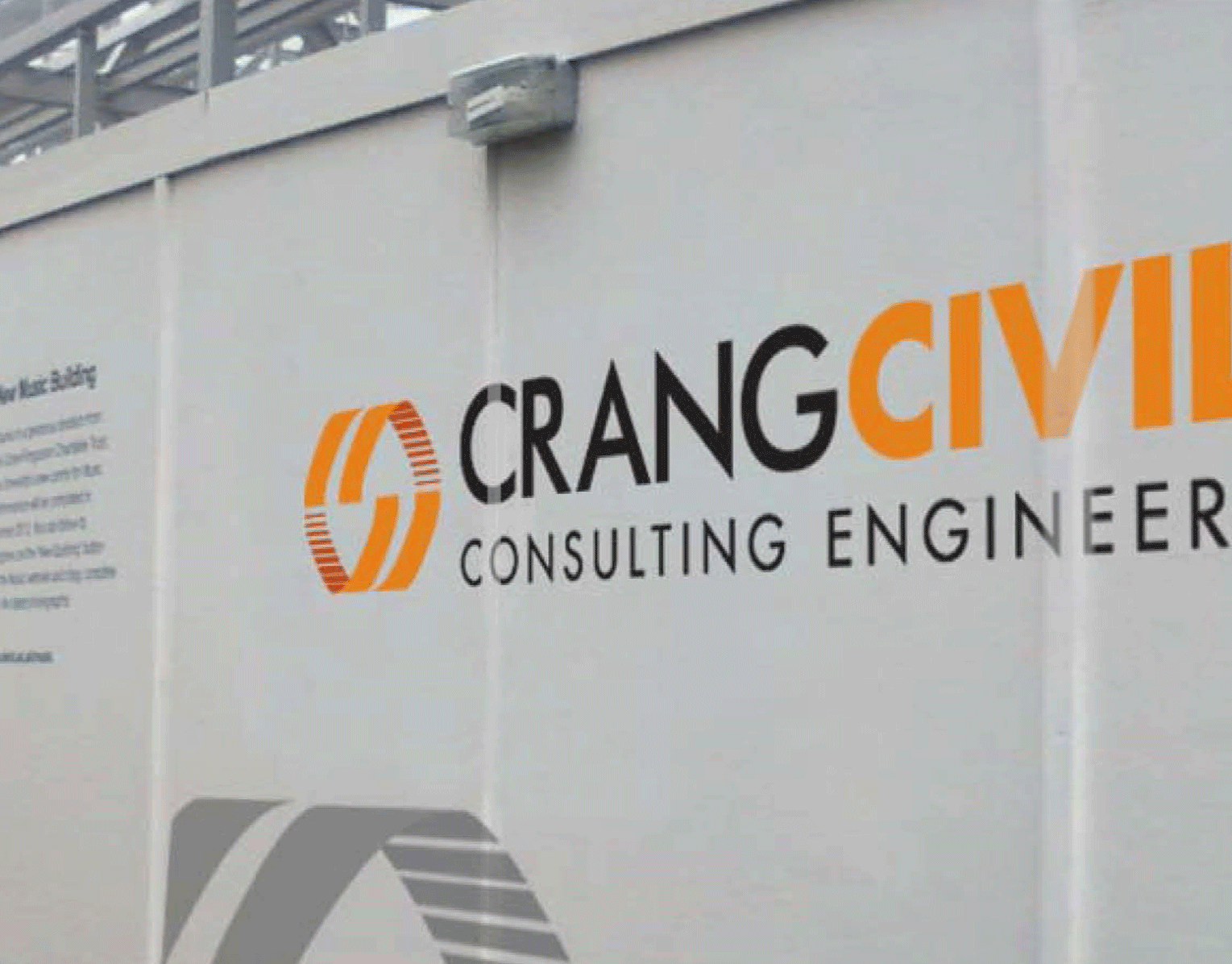
Building an identity from the ground up
One of Auckland’s leading civil engineering consultancies, specialising in infrastructure and land development, engaged Daniel Hillier to enhance their brand presence and better reflect their position in the industry. I developed and designed the original CrangCivil logo in 2012, and it continues to stand the test of time. Other ongoing projects included the development of stationery templates, vehicle liveries, signage graphics, and sponsorship branding. Additionally, a comprehensive corporate identity manual was created to ensure consistent and accurate application of the brand across all touchpoints by employees.
UEL brand refine
Brand refine
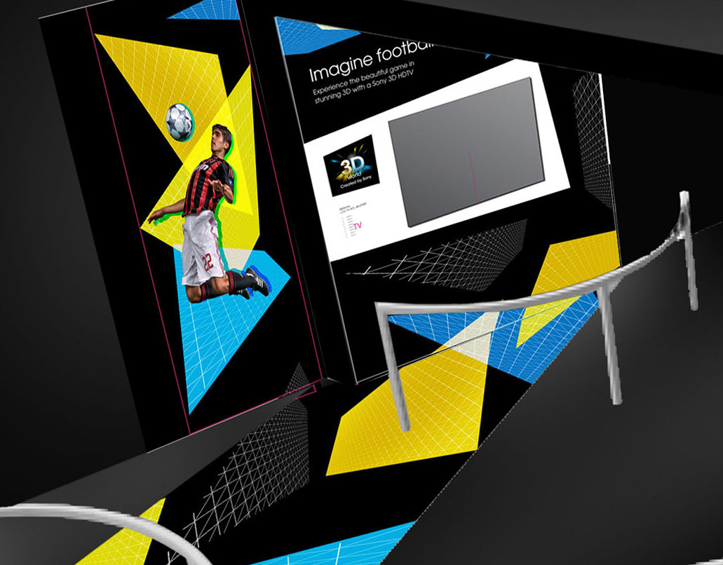
Sony 3D World Cup Interior Graphics
Interior graphics
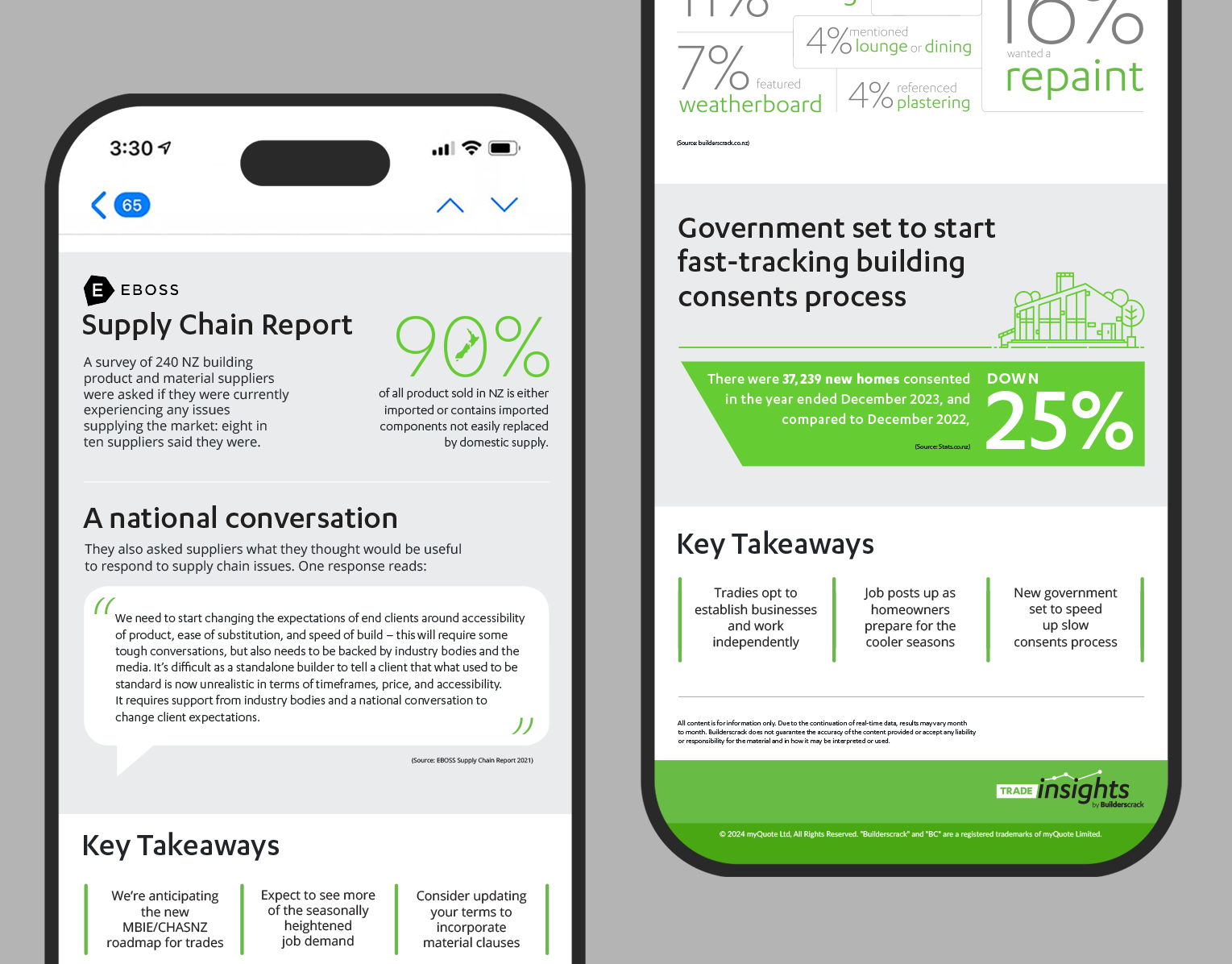

Bringing data to Life with Trade Insights infographics
Builderscrack Trade Insights is a data-driven tool that tracks and analyzes demand trends across the home improvement and construction sectors in New Zealand.
I collaborated with Builderscrack to design monthly statistical content and infographics for New Zealand's leading home improvement marketplace. This engagement began with the development of a distinctive Trade Insights logo and visual identity system, which supported the development team in launching and promoting the tool. The Trade Insights platform has received notable media attention in New Zealand for its role in delivering real-time data on trade demand and broader industry trends.

NSSL GLOBAL BRAND
NSSL GLOBAL BRAND
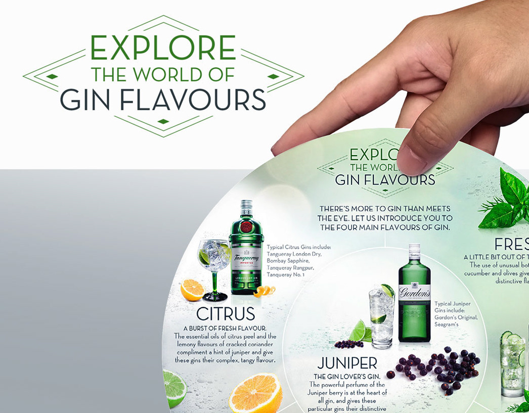
Showcasing Diageo's leading gins with tasteful design
Daniel was asked to help RPM create some tasteful design creative to explore the world of gin flavours through an informitive campaign to four leading gins from Diageo. Starting with a clean simple campaign mark, then develop this through a range of unique on-trade items that would clearly convey the flavour profiles that the respective gins aquire. Ultimately showcasing the four gins from Diageo.
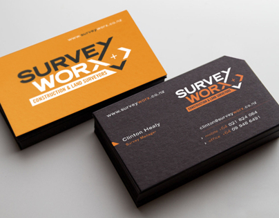
SurveyWorx Identity
SurveyWorx Land Surveyors Identity
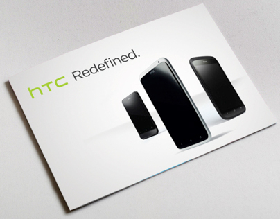
HTC Sense Brochure
HTC Brochure
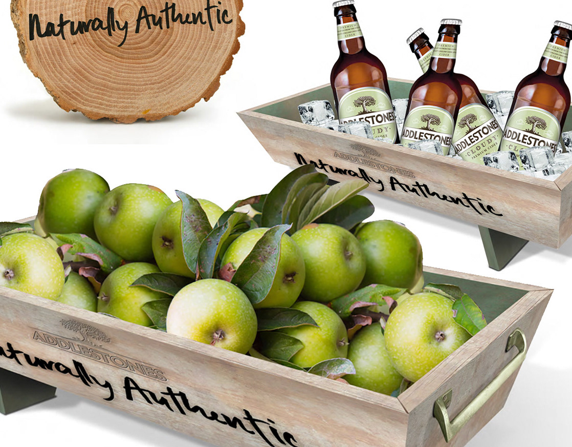
ADDLESTONES VISUALS
ADDLESTONES CIDER VISUALS
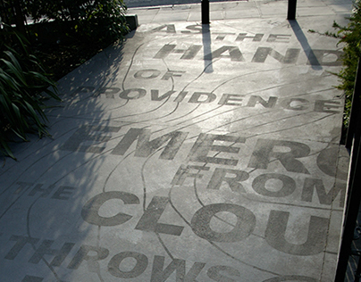
Astey's Row
ARCHITECTURAL GRAPHICS
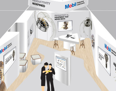
Mobil MIOGE Exhibit Concept
Mobil Exhibit Concept
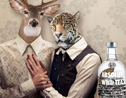
Absolut Wild Tea
Absolut Wild Tea launch campaign pitch
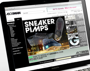
ASOS MAN brand r&d
ASOS MAN sub brand research & development
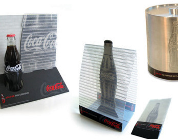
Coca-Cola CCGB
Coca-Cola Ontrade
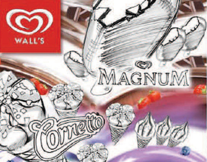
Walls Summer Menu Concepts
Menu Board Concepts

Jack Daniel's
Jack Daniel's email sends

Heineken_FSMS_Portal Template
Online template
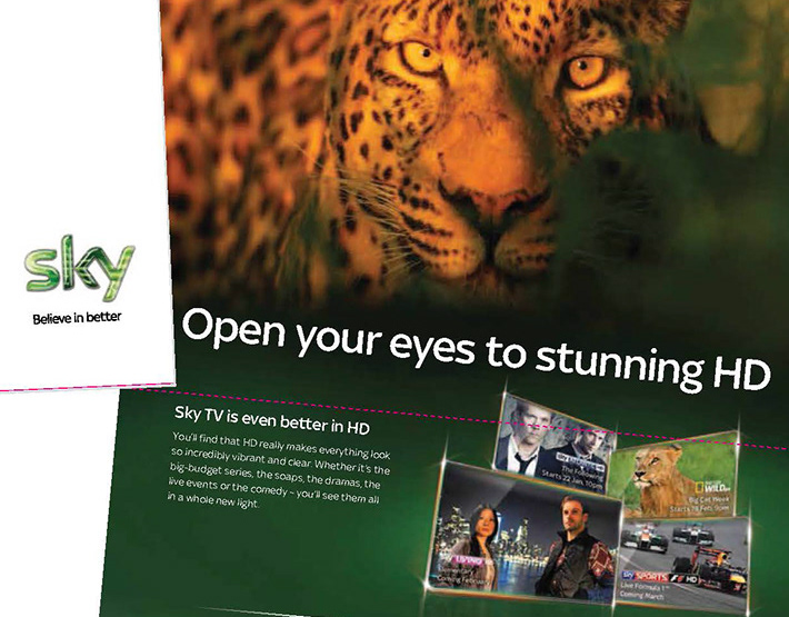
Sky
DM
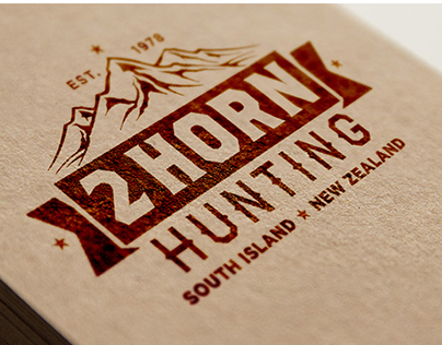
2 HORN HUNTING
2 HORN HUNTING LOGO
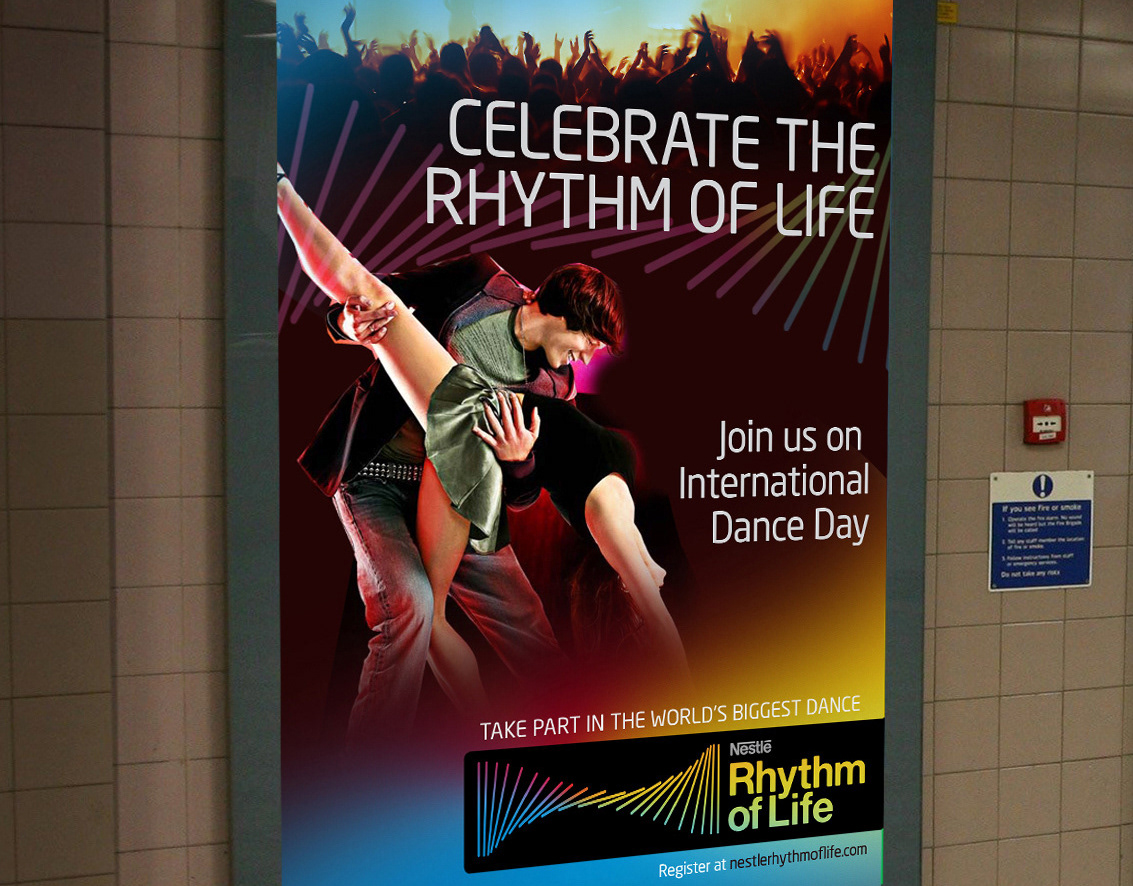
Nestlé - Rhythm of Life
Global Campaign Pitch
